A large part of my job is to write, re-write and give feedback on game design documents. I also give lectures at a private school with game design classes. And there is a bunch of beginner mistakes that I often see from students and design interns.
Creative instead of technical writing
There might well be a place for you to vent all that creative energy. You could take up pottery or painting as a hobby. Just don’t try to build your professional game design career on that one cool D&D campaign you DMed with your friends. Hell, even the game documentation that resembles regular Pen & Paper sourcebooks the closest – World and Style guides – still requires you to be primarily structured, comb out the filler words and get the information across.
This whole posting could be summarized into “It is TECHNICAL writing, stupid!” and some links to freely available, excellent online guides on the topic. Seriously, there are huge differences between a game writer and a designer job. And if the application you replied to clearly states “looking for designers”, then do not try to sell yourself on your awesome creative writing and that fanfic you wrote months ago.
Confusing documentation types
Surprise! There are a lot of different documentation types when designing games. All of them have specific purposes and audiences. A pitching document, for example, is used to sell a project to potential investors. So, yes, you are allowed to use some marketing speech and even drop the occasional “epic” and “awesome”. It should be clear and to the point, and consist not solely of a detailed description of your background story and characters. A “Detailed Design Document” or whatever you call your main rulebook should contain just that: The rules of the game. Ideally in a way that is easily understandable by developers and producers. They care less about the intricate happenings in you game’s universe last centuries.
Inconsistency
This beginner’s mistake usually comes in two forms: Inconsistency of layout and inconsistency of content. The first one creates a rag-tag look of document pages that forces readers to slowly scan the whole page and figuring out where the bit of information they need is placed this time. This can be avoided by establishing strict templates and formatting rules.
Inconsistency of content usually happens when no design glossary and structure is present. Suddenly, you got five different names for the same object, designers argue about semantics and every time you ask someone “What ‘resources” exactly?” you get a different answer. This is even more pronounced when the documentation is not written in your native language (yes, we are writing documentation in English but talk is still German). Some English terms get rapidly over-used, since the synonyms are not easily available to all readers. A glossary may help, but ultimately you need really good communication between team members or everyone will stay in his own definition spaces.
Over-specification
Do not put your balancing values into the design doc. Ever. It’s alright to give some indicators like “[few] hitpoints or [max] level”. It’s also good to include relations like “this item type is stronger than all the others” but avoid precise numbers. The reason should be obvious: You will never be able to keep your design document up to date. Just accept it. The moment you start tweaking your game values, you create false information in your documentation. This could be overlooked if not for one caveat: If THAT information is false, what about ALL OTHER information on that page? You just made your audience disbelief your documentation in general. If you are a social person that can be nice, since now every developer will come to you to ask about the “correct” feature status instead of trusting the doc. Unfortunately, answering these questions all day will keep you from doing any other work you had scheduled.
Concerning work: Over-specification creates a lot of text that gets obsolete very fast. When you hit production phase, the priorities shift and features are iterated. And while that won’t be much of a problem for style guides and feature targets (and those shouldn’t change once production has started, right?!), detailed information does not survive when hit by production reality. Your only chance is to create living, flexible documents without week-long feedback and approval cycles. Mindmaps are very useful for this. That way you can keep up with production and iteration speed and give your developers precise and current implementation information.
Trying to solve everything in text
It’s the old “show, don’t tell” maxim. Sometimes it is enough to put a nice image in the header area of a page, so readers can more easily identify the topic. Apart from this visual anchor, images can greatly improve the readability of a feature descriptions. Take this example: “…then the player clicks on a button and a popup asks him if he really wants to pick his nose. If he has enough resources left, the ‘yes’ button is available, otherwise it is greyed out. The ‘no’ button is always available and will either close the popup or show a security popup to confirm his choice if his booger level is already at 23%, in which case…”. After how many words did you space out? How many different cases could be coming that modify the previous sentence?
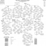
The above information can be easily communicated with a flowchart. And concerning flowcharts, please stick to these basic guidelines:
- No excessive use of colour and form. If you have to, include a legend and use it consistently.
- Make straight arrows, nothing diagonal or curved.
- Put the start of the chain in the top left corner (or wherever your regional reading customs usually start scanning a text).
- Do not put additional descriptions in the chart. It should be self-explanatory without much reading.
- Avoid uncontrolled growth. Charts tend to contain a lot of interconnected features. Focus on the one aspect you want to explain instead of putting the whole game into one image.
Well, that should be everything for now. Documentation done right is extremly useful in many ways, and essential if you work with top-down design structures. But please, make it relevant and easily readable. That way, you are helping designers around the world in the constant struggle to get developers to accept documentation.


